New website look
Would you look at that?! I just launched my new website design. It’s a somewhat soft launch because I’ve got more things planned. I went down a giant rabbit hole to reach this point, so I thought I would commemorate it with a post. It feels good to kick this out the door.
Look and feel
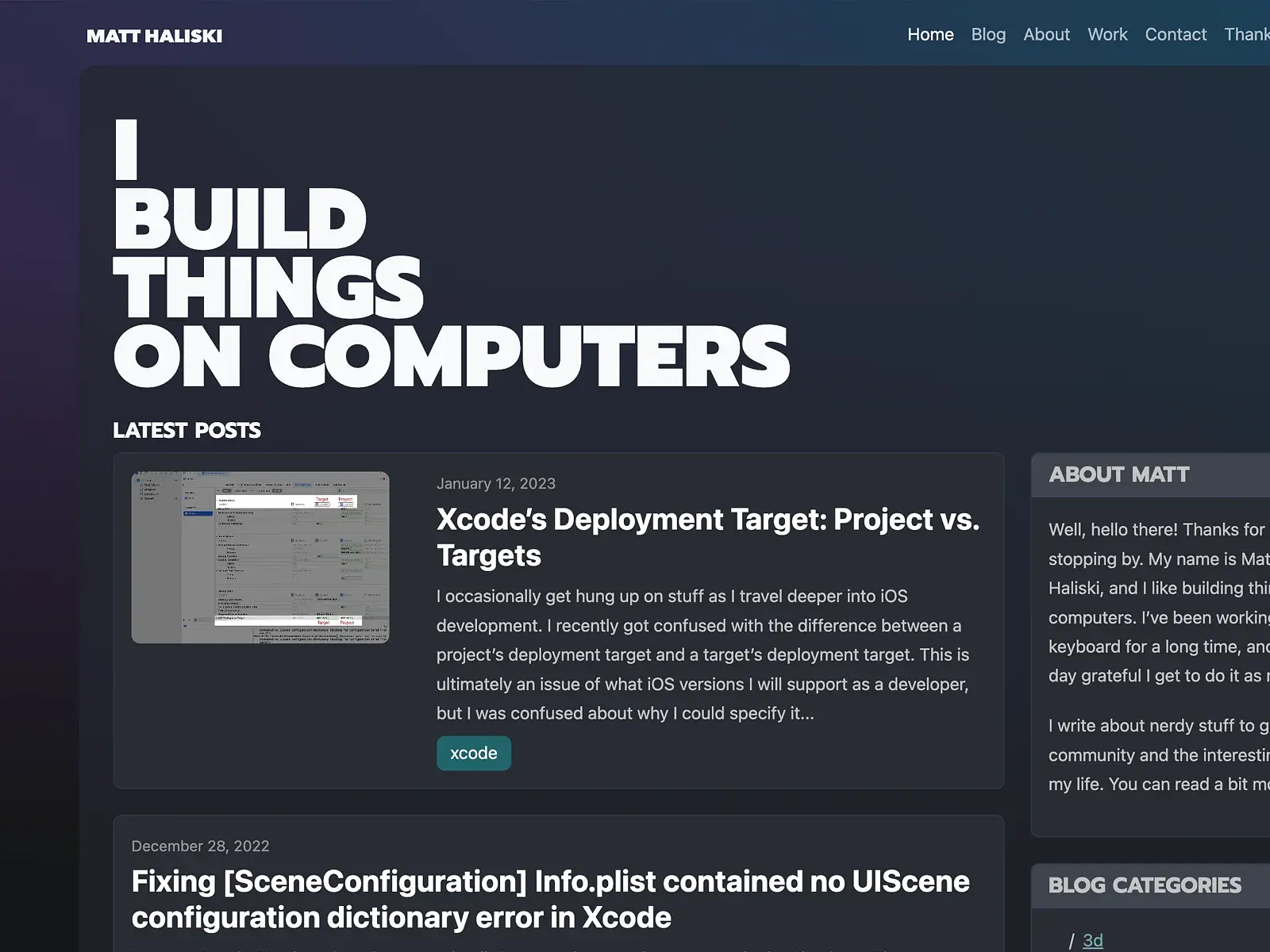
matthaliski.com has had a whitespace-heavy design for a long time. It is, after all, primarily a blog. I never wanted the design to feel dated if I didn’t get around to updating it for several years. It’s also much easier to code something that relies heavily on whitespace. That being said, I wanted to lean into the look and feel this time.
I aimed to design something modern and sexy. I agonized over the gradients and went with a somewhat “frosted glass” look for the primary page background. I wanted page titles to be heavy and impactful. This type choice may need some tweaking, as longer titles can be a bit much.
I decided to add featured images to posts. This probably had the most significant visual impact on the site. The prior theme was often just big walls of text. The images really help flesh things out a bit.
Color modes
The ability to have light and dark modes was probably the thing that pushed me over the edge to start creating a new site. I use Bootstrap as a frontend toolkit, and I had been waiting for version 5.3 to arrive because it introduced color modes into its framework. I wanted to wait for Bootstrap’s implementation because I didn’t want to reinvent the wheel and rip it all out once v5.3 dropped.
If you’re curious about how Bootstrap manages its own and native CSS variables, you can peek at this little chart I made.
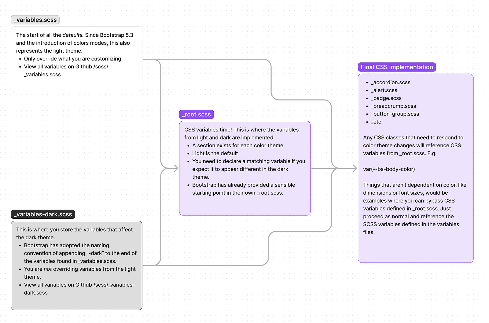
I’ll say implementing color modes is a ton of work. Combining responsive design and color modes makes it feel like you’re designing a hundred different sites simultaneously. I can’t imagine how difficult a task it would be on a large corporate website with thousands of pages. It’s a simple fact that some elements work better on light backgrounds than dark. Drop shadows, anyone?
More to come
Anywho, I’ve got quite a few issues to tick off for this build, but I’m happy with the initial phase. I need to get back to Swift and iOS development and wrap up this web stuff. I hope you (or at least your nighttime eyes) appreciate the new design.
Enjoy the weekend, and remember to get outside and touch grass.